
You unlock your phone to check the weather real quick, and twenty minutes later you’re somehow three videos deep into a social media feed you didn’t mean to open. It happens to everyone. But here’s the thing — it’s not entirely your fault. A cluttered home screen is basically a trap designed to pull your attention in every direction except the one you intended.
The average person has over eighty apps installed and uses fewer than ten of them daily. Yet all eighty are competing for space on your screen, flashing badges, and begging for taps. The good news? Spending about fifteen minutes reorganizing your phone can save you hours of frustration every month. And you don’t need to be a minimalist or a design expert to pull it off.
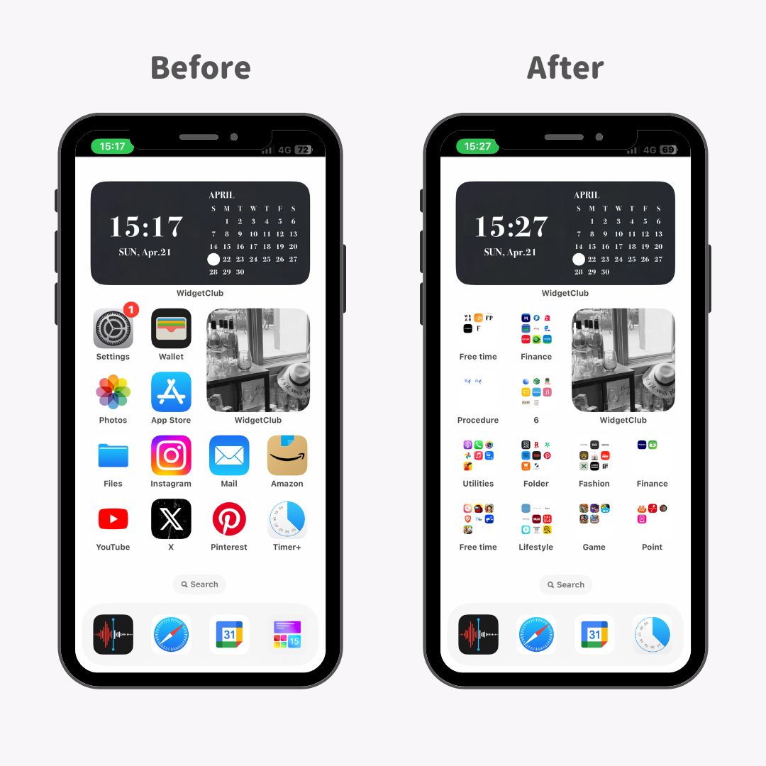
Start With a Brutal App Audit
Before you drag a single icon, you need to know what you’re actually working with. Go through every app on your phone and ask one simple question: did I open this in the last month? If the answer is no, it’s probably time to let it go. cite🛠web_search:7#7:~:text=make a list of the apps currently on your mobile device that you use daily for intentional purposes
Be honest about the apps that eat your time without adding value. That game you downloaded during a layover six months ago? The coupon app you used once? The third photo editing tool that does the exact same thing as the built-in one? Delete them. Offloading unused apps doesn’t just free up storage — it removes visual noise that slows down your decision-making every time you unlock your screen.
On iPhone, you can enable “Offload Unused Apps” in Settings to automate this. On Android, the Play Store has a similar app hibernation feature. But manual deletion is better because it forces you to make conscious choices about what deserves space in your digital life.
Pick an Organization System That Matches Your Brain
There’s no single right way to organize a phone. What matters is finding a system that matches how you actually think. Here are four approaches that work for different types of people.
Verb-based folders are perfect if you think in actions rather than categories. Instead of a folder called “Productivity,” you create folders labeled “Watch,” “Listen,” “Read,” “Buy,” and “Track.” When you want to do something, you know exactly where to go. cite🛠web_search:7#3:~:text=Labeling folders with verbs such as watch, play, and learn can help you jump to the app you're looking for infinitely faster
Themed rows work well if you prefer scanning to tapping. Each row on your home screen gets a theme — day planning, communication, entertainment, finance. No folders needed. Your thumb learns the muscle memory of where each row lives, and finding apps becomes almost automatic.
Color coding is surprisingly effective if you’re visually oriented. Your brain recognizes colors faster than it reads text. Grouping apps by their dominant icon color — blues together, reds together, greens together — creates a layout that feels intuitive even if the categories make no logical sense. cite🛠web_search:7#3:~:text=Your mind associates colors much quicker than black and white name labels, and colors can help you navigate your phone faster
Frequency-based placement is the most practical approach for busy people. Your most-used apps live on the first page, either as standalone icons or in a small dock. Everything else gets buried in folders on page two or tucked into the app drawer. The goal is one-tap access to the ten apps you actually need. cite🛠web_search:7#3:~:text=Place the apps you use most on the first page of the home screen
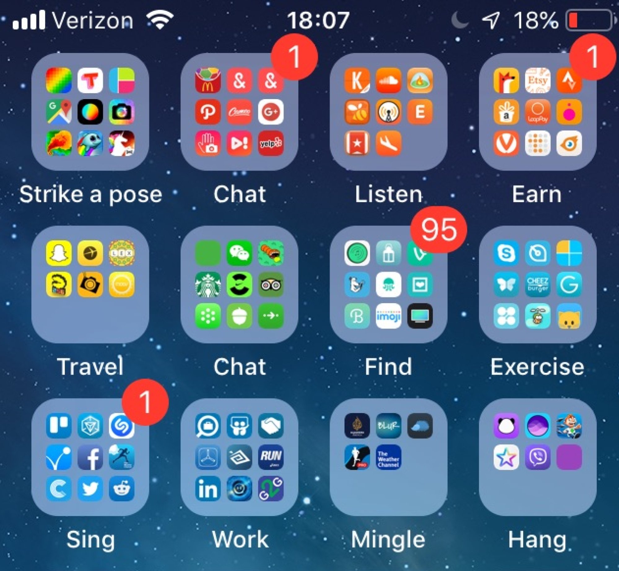
Master the Dock and the First Page
The dock — that row of icons at the bottom of your screen — is prime real estate. It stays visible no matter which page you’re on, so treat it like your phone’s command center. Most people default to Phone, Messages, Safari, and Music. That’s fine, but customize it for your actual life.
If you’re a heavy Slack or Teams user, put your work communicator there. If you navigate more than you call, swap Phone for Maps. If you journal daily, Notes or your preferred app deserves that spot. The dock should hold the four apps you open reflexively, not the four apps Apple thinks you need.
For the first page, limit yourself to one or two widgets and no more than twelve app icons or folders. One Android Police editor uses a 5x9 grid with just two widgets — a Google Calendar widget at the top and a search bar below it — and keeps everything else in themed rows. cite🛠web_search:7#4:~:text=Since I prefer dense home screen layouts...I started by customizing the dock...limit myself to two widgets
The empty space isn’t wasted. It’s breathing room. A crowded screen creates decision fatigue. A sparse one guides your eye exactly where it needs to go.
Use Folders Wisely, Not Obsessively
Folders are useful, but they can also become junk drawers. The moment you create a “Miscellaneous” or “Random” folder, you’ve lost the battle. Every folder should have a clear, specific purpose and a name that tells you instantly what’s inside.
Keep folder sizes manageable. If you need to scroll inside a folder, it’s too big. Nine apps per folder is a good maximum — anything more and you’re back to hunting. cite🛠web_search:7#9:~:text=keeping each folder to a max of 9 apps so everything remains visible from the home screen
On iPhone, you can nest folders or use emoji labels instead of text for a cleaner look. A 🎵 emoji for music apps or a 💰 for finance apps is faster to parse than reading words. On Android, many launchers let you create tabbed folders or automatically sort apps by category in the app drawer, which can eliminate the need for home screen folders entirely.
Comparison: Which Organization Method Fits You?
| Method | Best For | Setup Time | Maintenance |
|---|---|---|---|
| Verb-Based Folders | Action-oriented thinkers | 10 minutes | Low |
| Themed Rows | Visual scanners | 15 minutes | Low |
| Color Coding | Visual learners | 20 minutes | Medium |
| Frequency-Based | Practical minimalists | 10 minutes | Very low |
| Alphabetical | People who search more than browse | 5 minutes | Very low |
The Pros and Cons of a Reorganized Phone
Pros:
- Faster access to the apps you actually use
- Reduced decision fatigue and visual stress
- Fewer accidental opens of distracting apps
- Better battery life from deleting unused apps
- More storage space for photos and videos
Cons:
- Initial setup takes time and decision-making
- Color coding can be tricky with multicolored app icons
- Too many folders can hide apps you forget about
- Requires periodic maintenance as you install new apps
- May feel less “fun” if you enjoy a chaotic, full home screen
Expert Tip: The One-Touch Rule
Here’s the simplest standard for a well-organized phone: every app you use daily should be reachable in one touch from your home screen. If it takes two taps to open a folder and then find the app, that app either needs to be promoted or deleted. cite🛠web_search:7#7:~:text=Whatever your essential apps are, focus on cleaning up your home screen to only include them
Apply this ruthlessly. Your banking app might be important, but if you only check it twice a month, it doesn’t need home screen space. Your camera app? That probably deserves a spot. Your meditation app? Only if you actually meditate daily. The one-touch rule forces honesty about your real habits versus your aspirational ones.
Also, turn off the setting that automatically adds new app icons to your home screen. On iPhone, it’s in Settings > Home Screen. On Android, it’s usually in your launcher settings. New apps should go to the app drawer by default. You decide what earns a spot on your home screen, not the App Store.
Frequently Asked Questions
How many home screen pages should I have?
Aim for no more than two or three. The first page holds your daily essentials. The second page holds folders for secondary apps. Anything beyond that rarely gets used and just adds scrolling. If you need more than three pages, you probably have too many apps on your home screen. cite🛠web_search:7#3:~:text=the goal is to have no more than three home screens
Should I put social media apps on my home screen?
That depends on your discipline. If you check social media on a schedule and have notifications turned off, they can stay. But if you find yourself opening Instagram or TikTok every time you unlock your phone, move them to a folder on page two or remove them entirely. Out of sight really does mean out of mind. cite🛠web_search:7#7:~:text=If you're going to put social media apps on your home screen...you've got to have those notifications off
What’s the best way to organize apps on Android vs. iPhone?
Android gives you more flexibility. You can use custom launchers, change grid sizes, and create tabbed app drawers. iPhone is more restrictive but offers the App Library, which automatically categorizes apps and removes them from your home screen without deleting them. Both work well — the key is consistency, not the platform.
How do I maintain my organization over time?
Set a monthly reminder to audit your home screen. Delete apps you haven’t used, reorganize folders that have gotten messy, and check whether your dock still reflects your current habits. Digital organization, like physical organization, needs occasional tune-ups. A five-minute monthly review prevents a full rebuild later.
Do widgets help or hurt organization?
They help when used sparingly. A calendar widget, weather widget, or to-do list widget can save you taps and keep important info visible. But too many widgets create the same clutter you’re trying to escape. Limit yourself to one or two on your main page. Everything else is decoration, not utility.
Final Thoughts
Your phone is probably the object you interact with most in a given day. It deserves the same intentionality you’d give your desk, your closet, or your car. A disorganized phone doesn’t just waste time — it quietly trains your brain to be reactive instead of focused. Every extra icon is a potential distraction, and every unclear folder is a tiny decision that drains your mental energy.
The fix doesn’t require a complete digital detox or a minimalist aesthetic. It just requires thinking about what you actually do on your phone and designing the layout to support those actions. Start with the audit. Pick a system that fits how you think. Apply the one-touch rule. And then maintain it with a quick monthly check.
You’ll be amazed how much faster you find what you need — and how much less often you end up down a rabbit hole you never meant to enter.
🎥 Recommended Video
Watch: How to Organize Your Phone Home Screen for Maximum Productivity

No comments:
Post a Comment